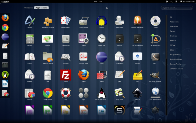
A couple of weeks ago I migrated my home computer to Fedora 15 featuring the new GNOME 3 user interface among other significant changes. At first it was quite a struggle to get used to, I almost rolled back to Fedora 14. After persevering for the first few days it got easier to work with, and dramatically I did notice a less ‘distracted’ way of working.
If you’ve not had a chance to see GNOME 3 here are some of the highlights;
- Gone are the Maximise and Minimise buttons from your windows. You can still Maximise a window by dragging it to the top bar where it will ‘ping’ outwards to fill the screen (you can also double-click the window title bar). Minimising no longer possible, instead windows overlap each other with the window you are working in always on top.
- So how do you switch between windows? Simplez, (a). If any part of a background window is visible you can click it to bring it to the surface, (b). You can ALT+TAB around your windows, and last but not least (c). You drag your mouse to the top-left corner (or press your Logo key) to bring up a novel new view that shows you miniaturised versions of all the active windows – clicking on the one you want brings it to the foreground.
- There is no more Taskbar at the bottom of the screen. Since you can no longer Minimise windows you don’t need window-buttons to resurface them. Instead this area is mostly inactive until ‘notifications’ pop up. The idea here is to let you know somethings’ happened (incoming IM, selinux warning, updates available) and leave it up to you to deal with it in your own time.
- No more Top Panel gadgets, widgets, do-dahs and thingamajigs. This was quite a shock to my system when I first entered GNOME 3, I was used to seeing my System Temps, Stock Ticker and Weather gadgets. As well as a host of shortcuts and launchers for my frequently used apps. There is a new way to write gadgets for GNOME 3 called ‘GnomeShell Extensions‘ and people are already developing newer minimalistic gadgets to take advantage of this. As for launchers, you can ‘pin’ your frequently used apps to the Favorites menu.
- Hierarchical Menus? No way, what you have now is big-fricking-buttons
which you can filter by category. Alternatively you can start typing fi and Firefox, Filezilla pop to the front of the list. This
search function also covers ‘Settings’ and ‘Recent Items’.
- The whole user-interface has been simplified and ‘dumbed’ down. In fact your Cat could operate GNOME 3 just by bashing the mouse – no skills required. It’s very much a ‘Tablet Ready’ interface and has a lot of similarities to the direction Google have taken with ‘Honeycomb’ (Android 3.0).
I should point out that all this sexy user interface comes at a (small) cost – your Graphics Card has to be up to the job. If it’s not you are pushed into a ‘Fallback’ mode which is like a half-old-half-new GNOME – if you are curious you can force it into ‘Fallback’ mode to see what its like.
Overall I am impressed with GNOME 3 for lightweight / home use, however in the office I am a bit of a window hoarder and live by my gadgets, launchers and do-dahs. The more I use GNOME 3 at home, the more I realise it would be a massive disruption to the way I work (at the moment). So for now I am more than happy with GNOME 2.x in the office, and perfectly happy to potter around on GNOME 3 at home.
Some screenshots are included below and illustrate some of the features I’ve mentioned. If you are feeling frisky why not grab a Live Image and try it out yourself!


Leave a Reply